Pup inflation: Good dogs getting better
America’s good dogs have become significantly better dogs over the past year.
That’s the inescapable conclusion from a statistical review of the world’s foremost source for professional dog ratings, the Twitter account WeRateDogs.
WeRateDogs’ paw-cess is simple and rigorous: people send him pictures of their dogs (and occasionally, allegedly, goats) and he responds with a number rating out of 10 about how good a dog the pup in question is.
They’re very good dogs indeed, as WeRateDogs’ unleashed 10-point rating system reflects:
This is Clark. He passed pupper training today. Round of appaws for Clark. 13/10 pic.twitter.com/7pUjwe8X6B
— WeRateDogs™ (@dog_rates) March 2, 2017
How good are the doggos? A database fetched from WeRateDogs’ Twitter account shows the average dog rated since Jan. 1, 2016 scores a h*cking amazing 10.95 out of 10. But we can dig deeper.
Good dogs getting better
Here’s a chart showing every single dog rating from January 1, 2016 to March 26, 2017:
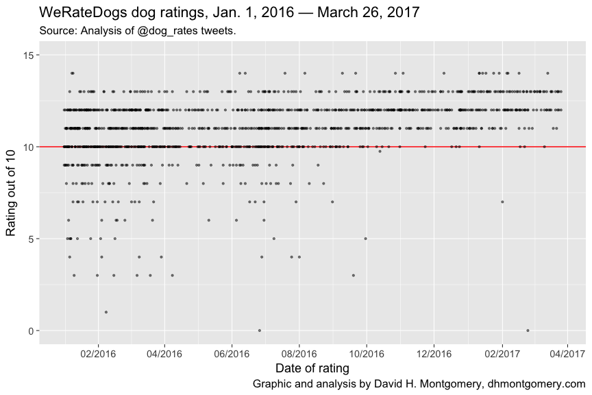
The sheer volume of 1,200 ratings over 15 months can make the chart hard to sniff out. The median dog rating is 11/10, while the single most common rating is 12/10.
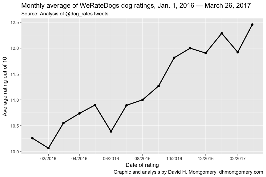
Masked in the plot is a pugnacious trend: America’s doggos are getting better and better:
Better good dogs, fewer bad dogs
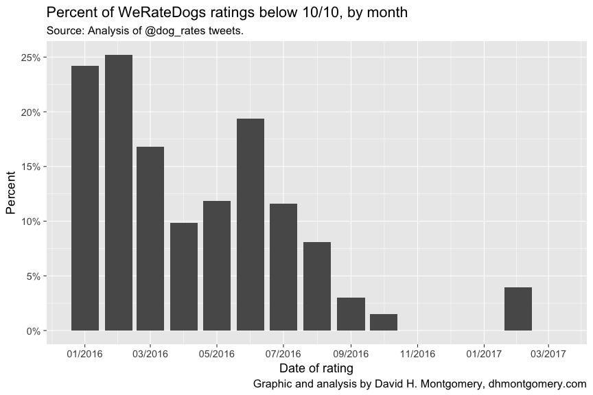
But there are actually two things happening here. WeRateDogs is finding more and more exceptional dogs — and fewer dogs are getting the short end of the stick. Early in 2016, up to a quarter of all dogs rated scored below 10/10. A year later, almost no dog ever scores less than perfect marks:
This tailspin in what passes for bad dogs isn’t the whole story, though. Barking out the dogs who scored at least 10/10, we see that these excellent dogs’ ratings have continued to increase independent of the decline in struggling pups:
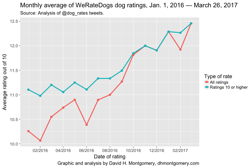
A turning point seems to have come around September 2016. That month sees the percent of quotidian dogs vanish entirely — and the superlative ratings shoot upward.
Coincidentally or not, September 2016 saw a signal moment: when WeRateDogs defended itself from a Twitter user named @Brant who said his “rating system sucks.”
@brant they're good dogs Brent
— WeRateDogs™ (@dog_rates) September 12, 2016
The share of dogs not earning 11s and 12s had already fallen significantly by the time of that exchange. But after defending his ratings with the instantly merchandized “They’re good dogs, Brent”, WeRateDogs evidently discovered that was even more the case than he already believed.
Devil’s advocate
We must consider one more, slightly ruffer explanation: the world’s dogs are not getting more fetching as much as WeRateDogs would have us believe.
(Dog-lovers might choose to dismiss this claw-ful attack as sour grapes from the author, a former cat owner.)
Remember that some — though not all — of the explanation for the improved dog ratings was a decline in more mediocre dogs. It could be that these dogs are still out there — but aren’t getting rated.
Why might we be hounded by this horrible thought? As it turns out, WeRateDogs has been rating fewer dogs of late. And as his ratings have become rarer, the bad dogs have disappeared:
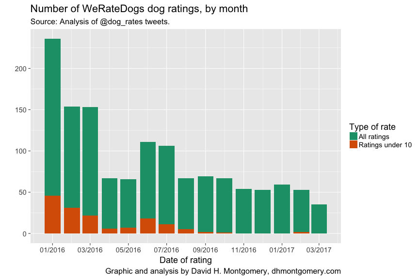
Of course, it’s understandable why WeRateDogs might have gone from six doggone ratings a day down to a more manageable two. He’s had to fight off copycat accounts and copyright trolls, all while attending college and now publishing a book.
Methodology
The database was acquired from the @dog_rates Twitter account using the tweet_dumper.py Python script by Gabriel Soule based on an original script by David Yanofsky. Because of the Twitter API’s limitations, only tweets from Jan. 1, 2016 onward could be obtained, missing the account’s first two months.
An R script was used to process the resulting spreadsheet, including removing all retweets and any tweet that didn’t contain a dog rating (marked by the character string, “/10”). The script extracted the rating out of 10 from each tweet, added it to a new column, and then graphed the results.
Only one rating was manually removed: a Fourth of July dog rated “1776/10”. Since the next-highest rating was 14, a score of 1776 would have significantly skewed the results.
You can view the code used to analyze and visualize this data, as well as the raw spreadsheet, here.
Thanks to Joe Raasch, Melissa Jamrock, Michele Molstead, Danny Lawhon, Spencer Krier, Matt Privratsky, Carrie Ruud and Dave Kamper for their help with puns.